Feature: Patient data
Illustrations: Hard facts, beautifully presented
Data are not always merely informative, but can also astonish, amuse or startle us. The editors of Horizons have put together some very different visualisations of medical information. They’re neither all equally relevant, nor equally reliable. But they’re all thought-provoking nonetheless.
-

-
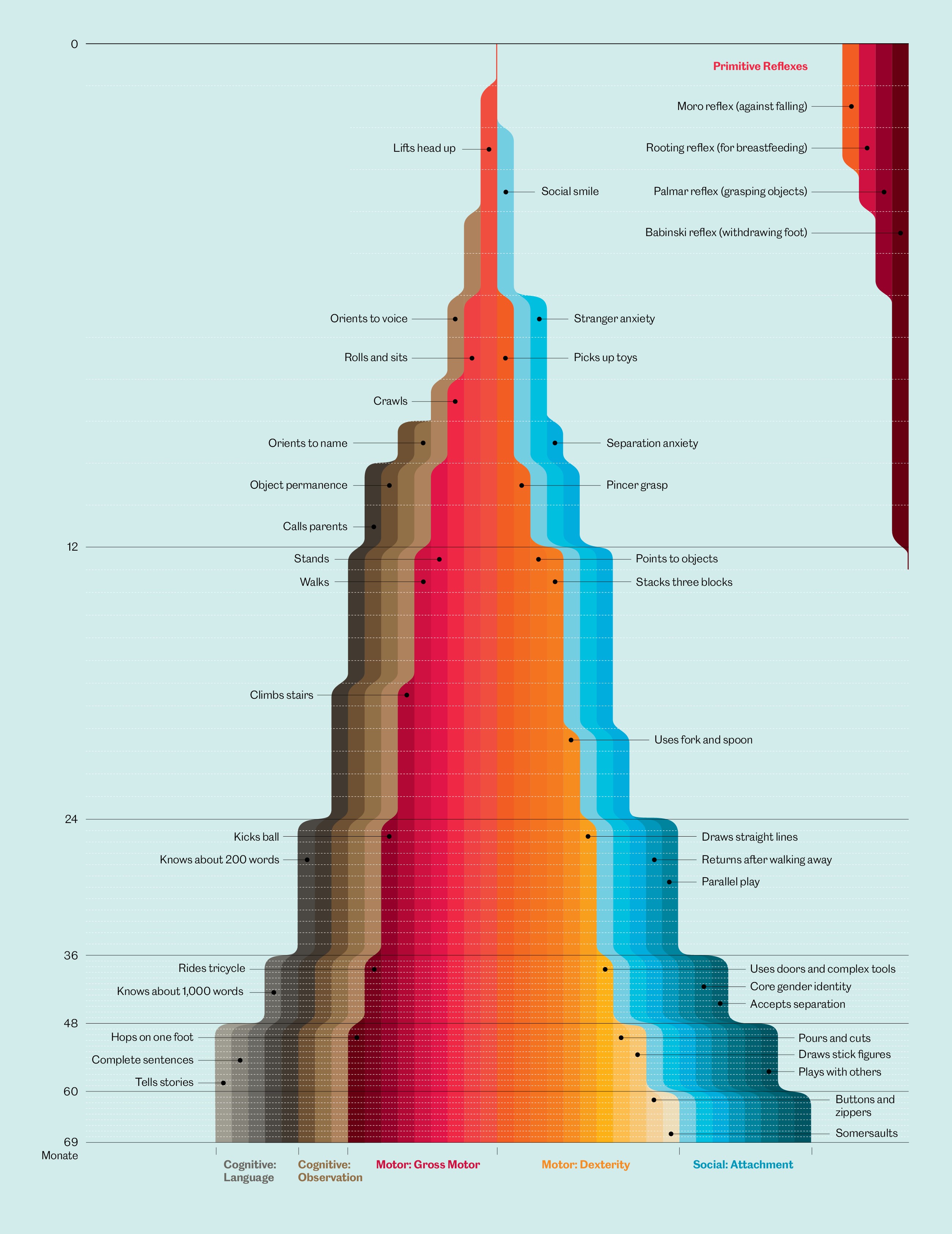
From newborn baby to kindergarten age
Just like little streams converging in a river, a child’s skills accumulate over the first 70 months of its life. The different colours here aid navigation between the major categories. The classification and timing vary, depending on the source. | Design: Eleanor Lutz for Nerdcore Medical, adapted by: Oculus Illustration
-
-
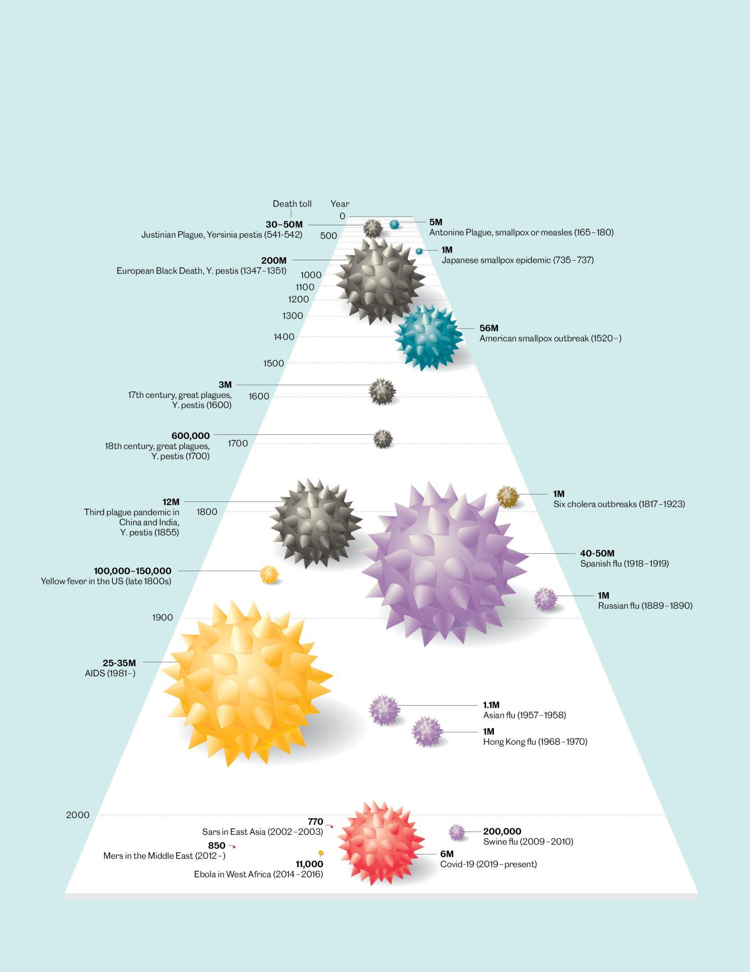
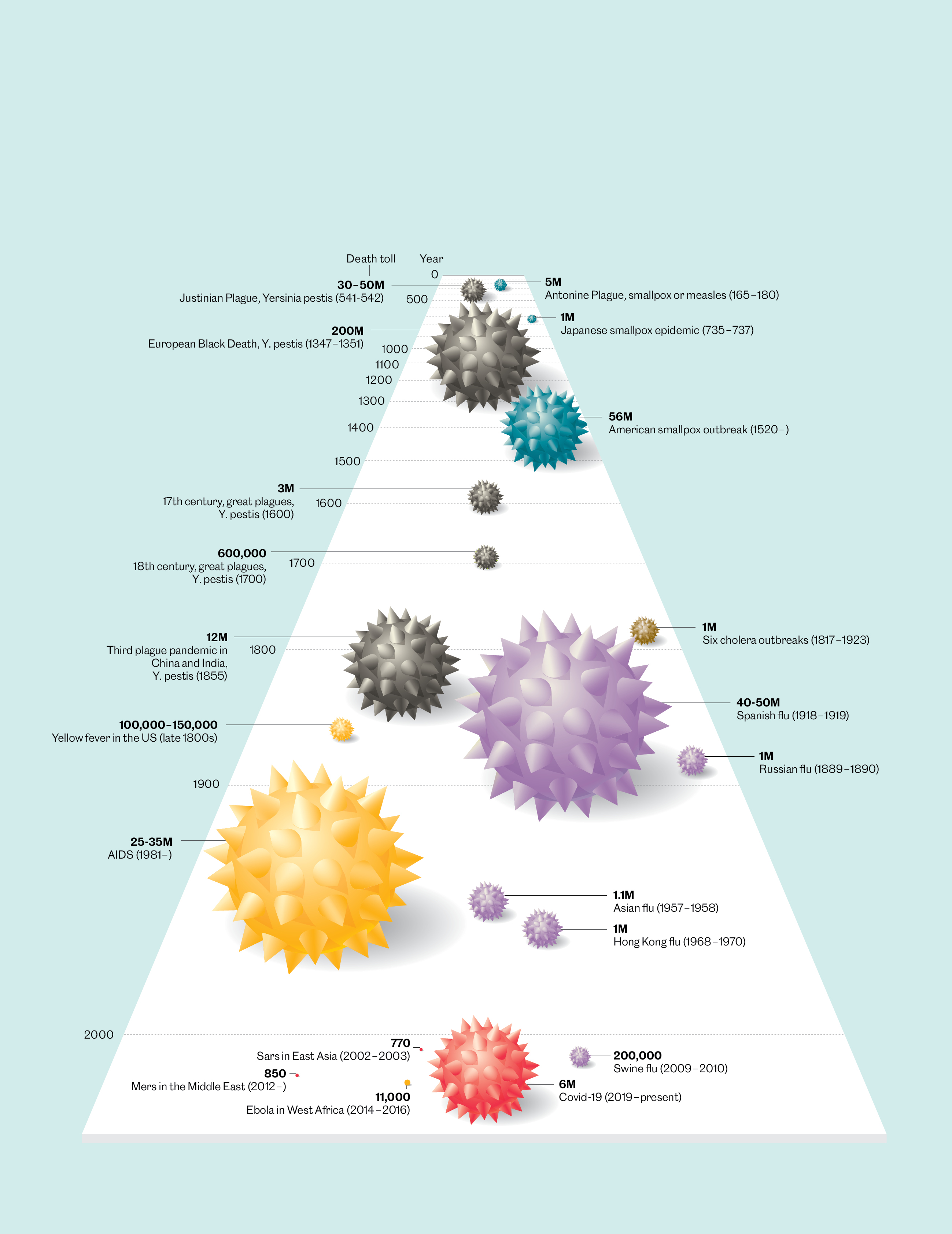
2000 years of pandemics
SARS-CoV-2 has made it clear yet again that infectious diseases can still be deadly. But this timeline shows that there have been worse pandemics over the last 2,000 years – we here show a selection from the Antonine Plague to Covid-19 (figures up to 1 March 2022). | Data: Nicholas Le Pan, design: Harrison Schell, adapted by: Oculus Illustration
-

-
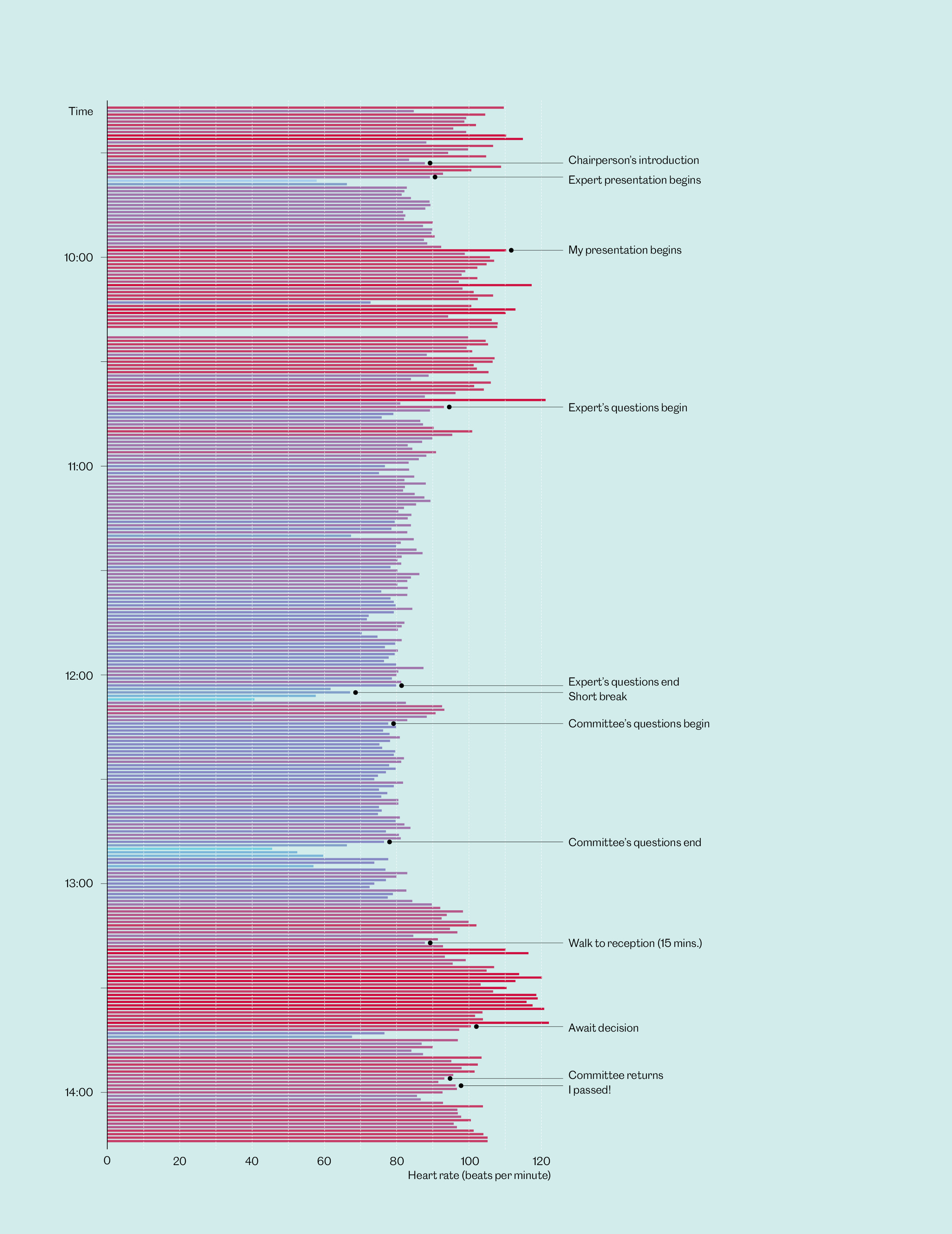
Pulse rate while defending a doctoral thesis
Our pulse rate can show our performance during a marathon – or the emotional strain endured while defending a doctoral thesis. The data scientist Granville Matheson recorded, visualised and published the data on his own racing heart during his oral exam. | Data and design: Granville Matheson, adapted by: Oculus Illustration
-

-
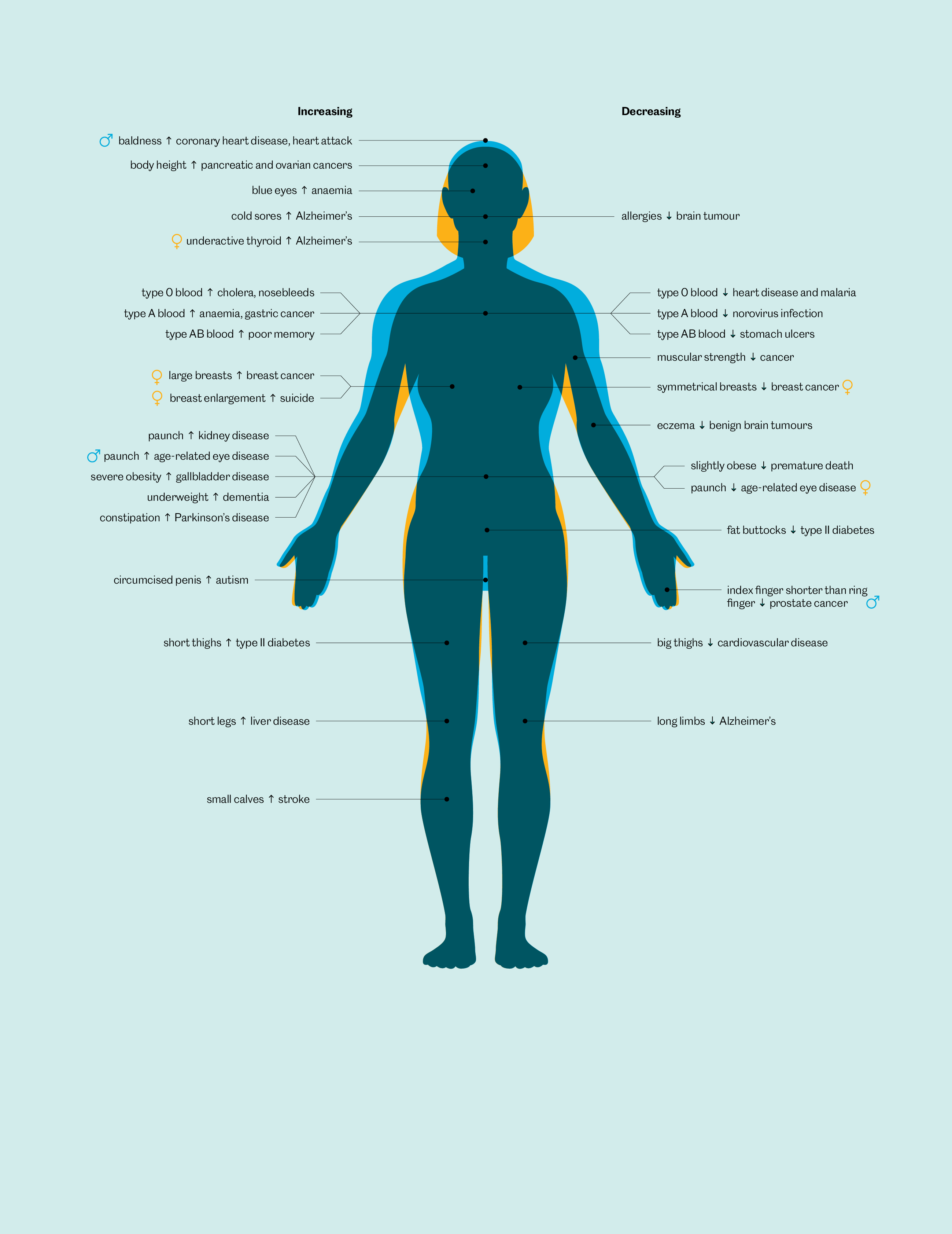
Watch out for misleading facts!
Beware: this graphic suggests certainty. But every statement given here is based on a single study. The risk of bias is high, the statistical correlations are weak, and even those correlations that can be confirmed say nothing about causes or effects. | Data: Stephanie Starling, design: David McCandless and Fabio Bergamaschi, adapted by: Oculus Illustration
-

-
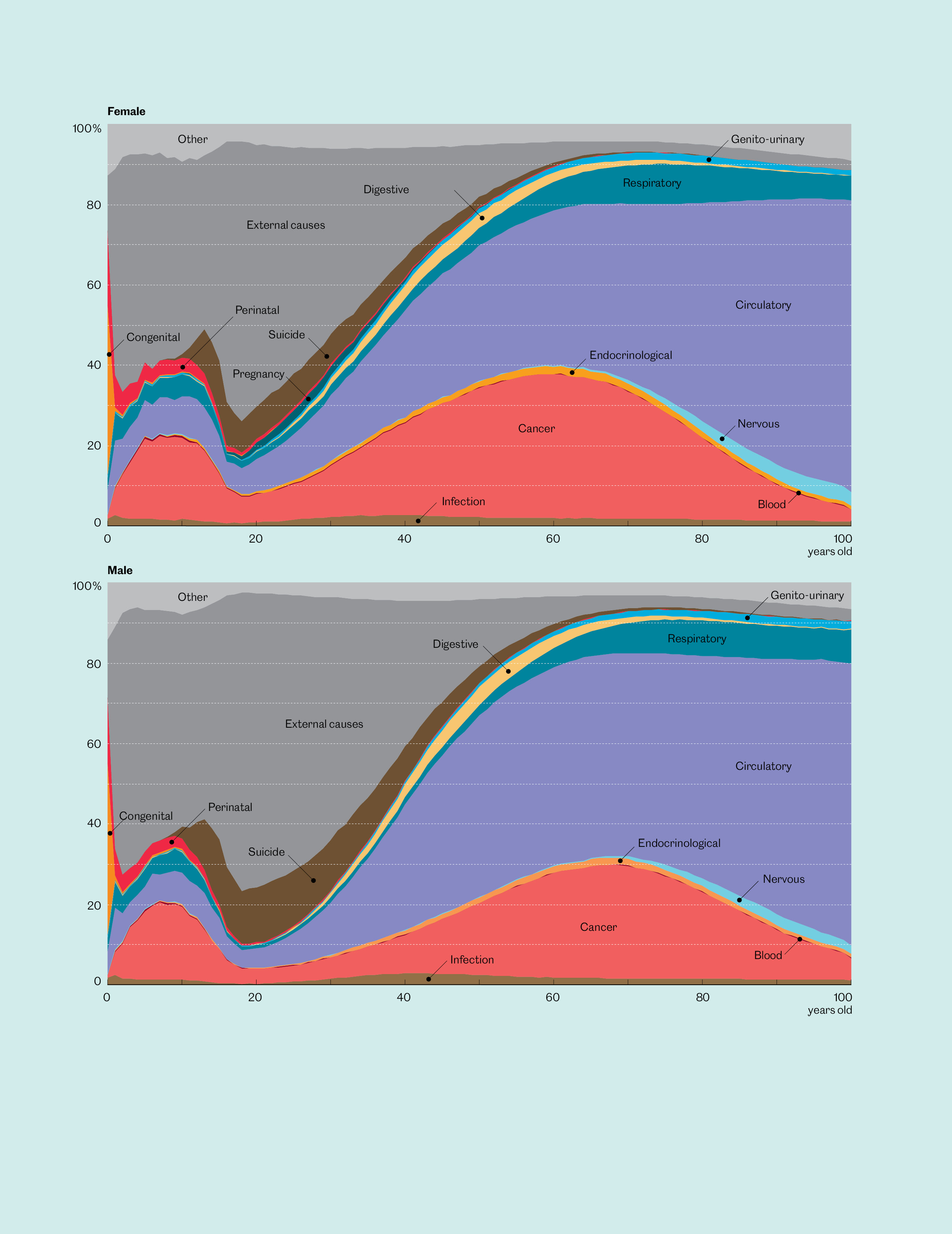
The young die differently from the old
Over the course of a lifetime, the likely causes of our death change. From 1999 to 2021, the US Centers for Disease Control and Prevention registered causes of death at all ages, illustrating what is most likely to kill us at what phase in our lives. | Idea and online animation: Nathan Yau, adapted by: Oculus Illustration